Amœba
Branding identity for Amœba Jewellery.
Role: Art Direction & Design
Curated collections of Sterling Silver Jewellery. Ethically sourced from India and Thailand. Cape Town based.
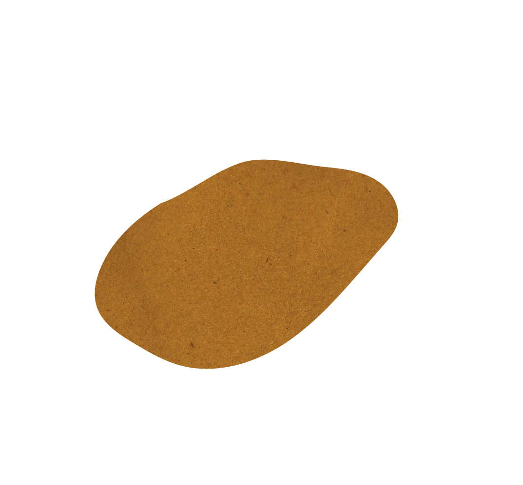
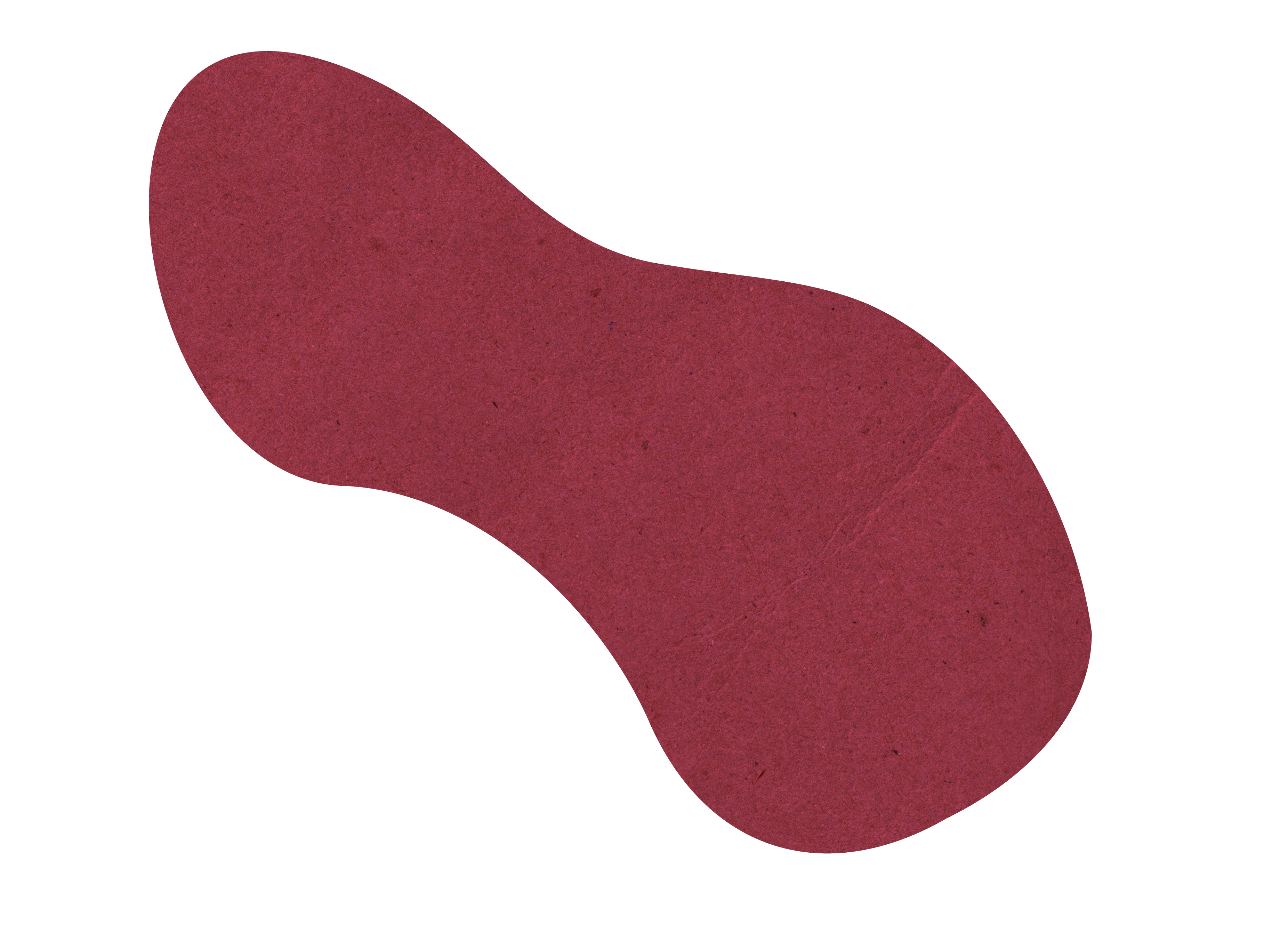
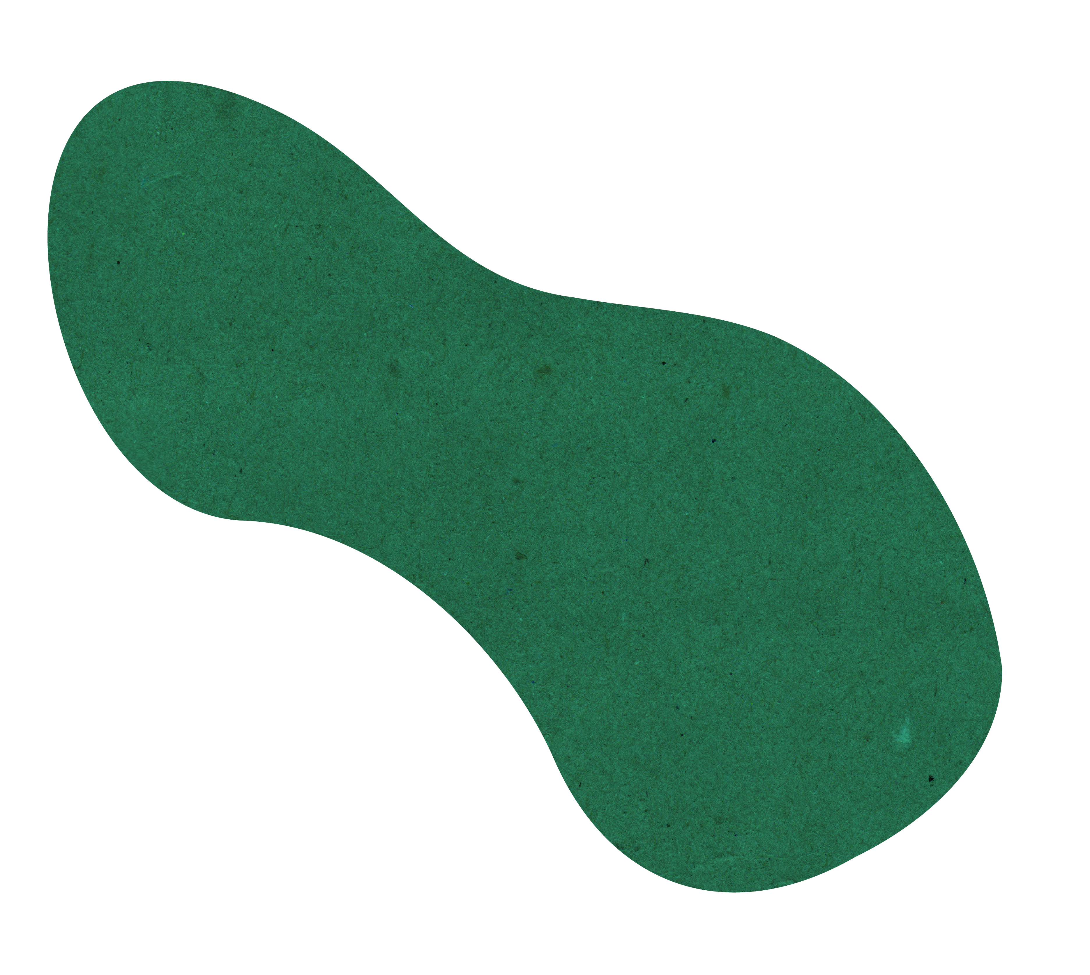
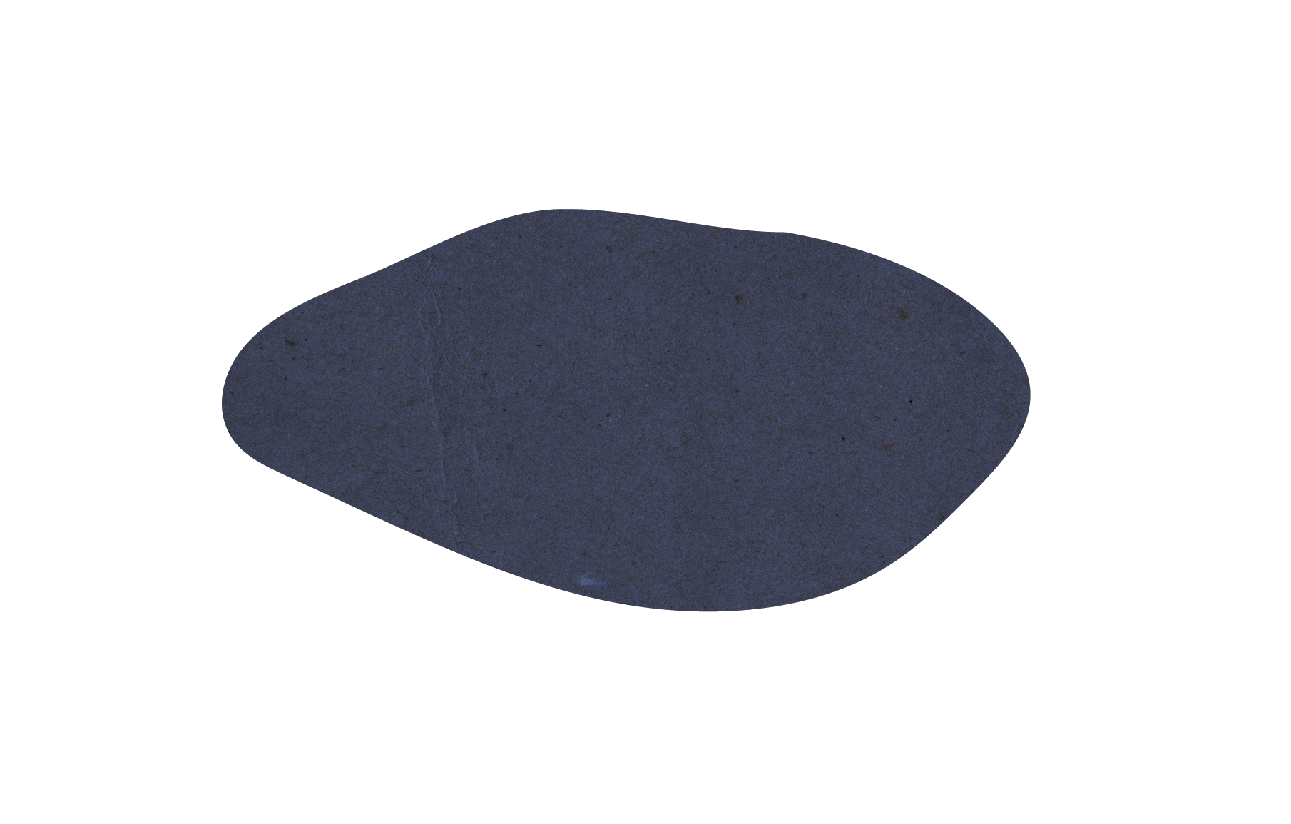
Pictorial mark references the amoeba unicellular organism, reiterated by the old Latin alphabet grapheme, œ. The brand and much like its cellular counterpart aims to create something fluid and adaptable to its environment. The lettering a treated version of Futura gives the effect of jewellery with polished rounded edges and the graphic elements much like the stones included in the brand’s collections.


︎ @amoebajewellery
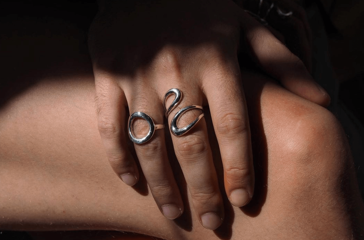

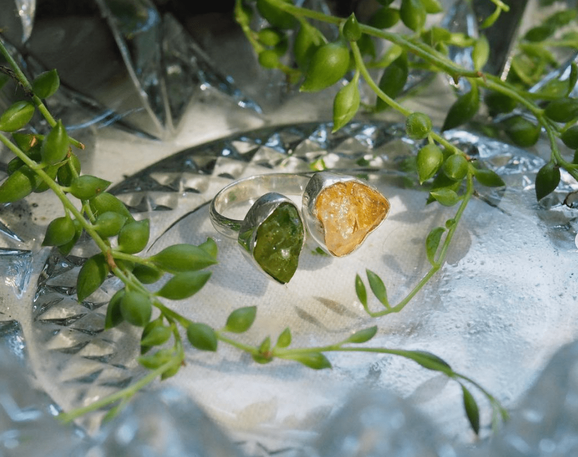
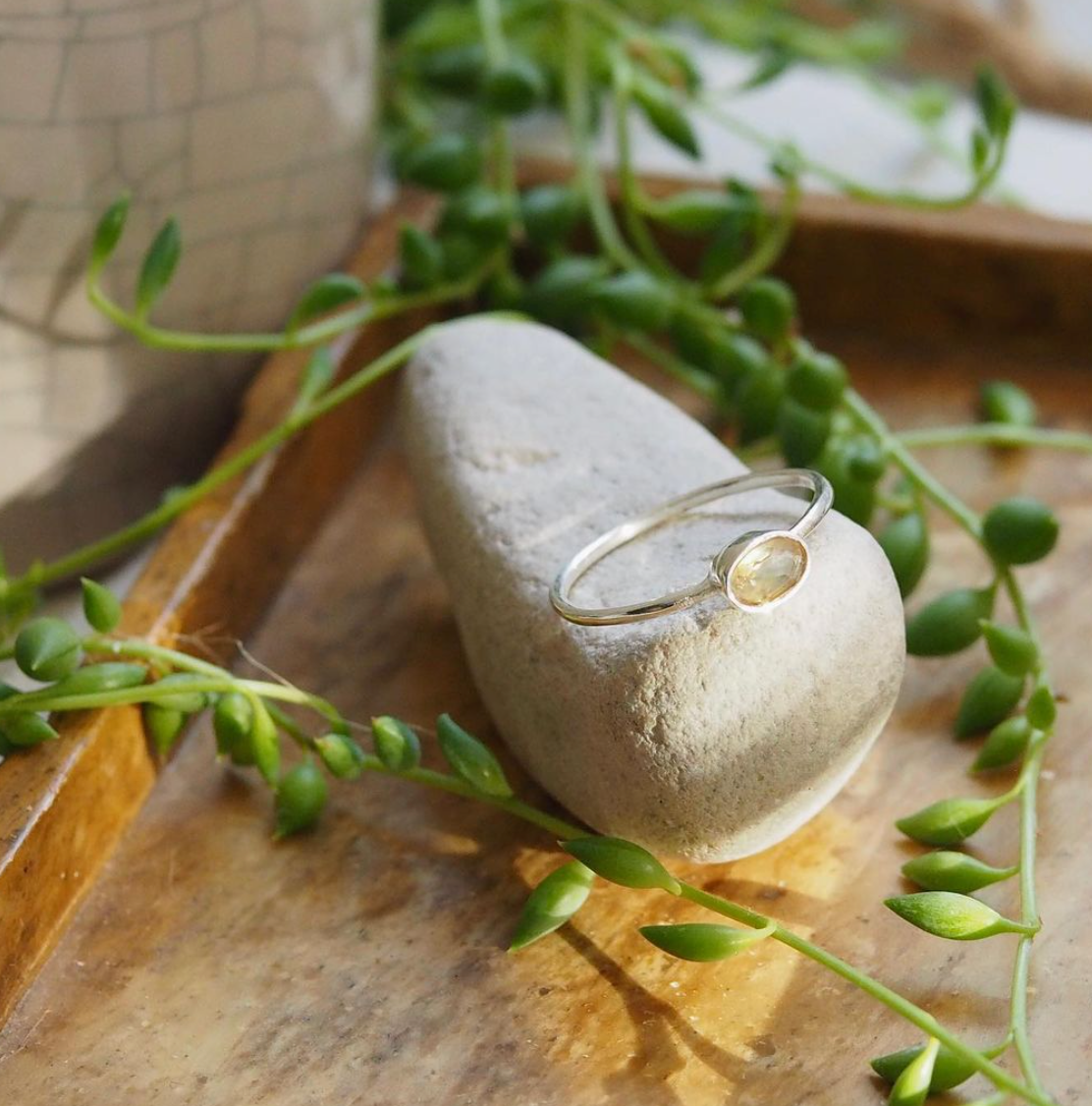
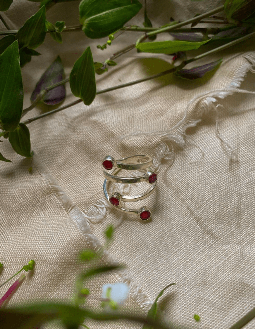
Photography & styling by Amœba Jewellery