Cape Town Globalist
International News & Current Affairs Publication
Role: Art Direction, Design, Illustration, Infographics, Editorial
Since 2012 I had been doing layout and design for my university's international current affairs publication, The Cape Town Globalist. In 2014 I took over as head of layout and design, where I made slight renovations on the cover template. (see link)
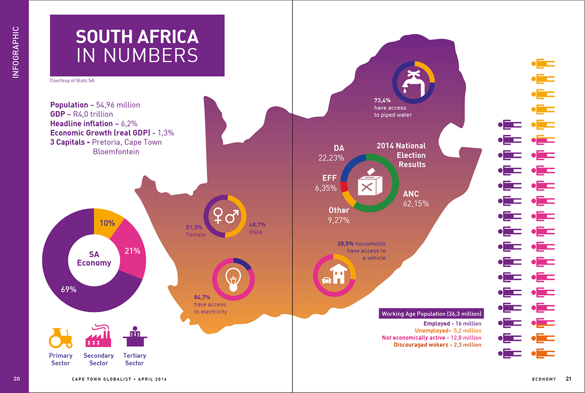
At the beginning of 2016 (my last year at The Globalist) I decided to clean the aesthetic up with a complete revamp on the entire look and feel of the publication, as well as to simplify the template for the incoming design team. Inspired by Jacobin Magazine, the move was to include more colour, illustrations, and more breathing space around text and images. I felt the delicate aesthetics of grand old news magazines and red motifs within this genre of publication were fading. So text, illustration style, and graphic elements would be bolder and rounded to induce a more approachable atmosphere. Most Globalist issues included photo essays but it was decided with the editor that the centrefold for this issue would include an infographic. Body font was moved from Warnock to Baskerville, and headers/sub-headers/pull-quotes moved from Roboto to DIN. Unfortunately due to lack of funding this issue was unable to go to print.
Below are some spreads I designed for this issue. All illustration and design is my own. Texts and photographs credited respectively in each spread.